 RankEngine
You've just exported a polished 2400 × 800 banner from Canva. On your laptop it looks crisp and balanced. On a large monitor, the artwork feels softer than expected. On a phone, the headline is partly missing and the model has been pushed out of frame. The file wasn't necessarily wrong. The assumption behind it was.
A useful banner image size isn't one universal pixel setting. It's a responsive delivery decision that starts with a high-quality master canvas and ends with crops or variants for the theme, viewport, and device pixel density. That decision also affects Largest Contentful Paint, accessibility, and whether your promotional message survives a mobile crop.
Table of Contents
- The Banner Sizing Problem Nobody Talks About
- Three Banner Types You Will Actually Build
- From 468x60 to 1920 Wide How Banner Sizes Evolved
- Shopify Hero and Banner Dimensions That Work
- Aspect Ratios and Safe Zones for Social Headers
- File Size, Compression, and LCP Tradeoffs
- Responsive Delivery With Srcset and Lazy Loading
- Writing Alt Text Banners Actually Need
- Choosing the Right Image Format
- Pre-Publish Checklist for Banner Images
- Frequently Asked Banner Image Questions
The Banner Sizing Problem Nobody Talks About
Shopify storefronts don't display an uploaded image in a vacuum. The theme decides how much of the image is visible, whether it uses a fixed-height section, where the focal point sits, and how the layout changes on smaller screens. Dawn, Prestige, and Warehouse can all present the same source artwork differently.
That's why a merchant can upload one image and see three different results. Desktop may preserve the wide composition, while mobile uses a much shorter or taller crop. If the headline sits near the edge, the theme may remove the one piece of information that makes the banner useful.
Practical rule: Design the artwork for cropping, not just for the canvas you see in your design tool.
The first decision is the master canvas. It should contain the largest practical version of the artwork, with the logo, faces, product, and text positioned away from crop edges. From that master, create device-specific versions when the composition changes materially. A mobile image often needs a different arrangement, not merely a smaller file.
The second decision is delivery. A full-width hero can become the page's largest visible element, so an oversized file may delay LCP. A compressed or undersized file can look soft on a large display. The correct choice balances clarity against transfer weight instead of treating pixels as a quality score.
The third decision is meaning. If the banner communicates an offer, its alt text needs to communicate that offer too. If it's purely decorative and repeats nearby content, an empty alt attribute is usually more appropriate. Pixel dimensions, loading behavior, and accessibility belong in the same implementation conversation.
Three Banner Types You Will Actually Build
Most Shopify stores use three banner categories, and each needs a different image strategy.
Full-width hero banners
A hero sits above the fold and introduces the brand, campaign, or primary product. It usually occupies a substantial portion of the first screen, so the artwork must remain legible at wide desktop widths and still work after mobile cropping. Product placement, headline length, and contrast matter more here than the nominal pixel count.
Treat the hero as a composition with responsive states. A desktop version may place the product on the right and text on the left. A mobile variant may stack the product above the copy or move the focal subject toward the center.
Collection and category headers
A collection header provides context between the navigation and product grid. Visitors have already chosen a category, so the image doesn't need to carry the entire brand introduction. A restrained crop, lighter file, and short supporting message often work better than a cinematic homepage hero.
The header should clarify where the visitor is and preserve the path to products. If the image competes with the collection title, it's doing too much.
Promotional ad units
Promotional units appear in sliders, homepage feature blocks, announcement areas, and campaign tiles. They're click targets, so the message must remain readable when the unit is small or viewed quickly. Decorative detail that looks impressive in a large hero can become visual noise in an ad slot.
Use a clear hierarchy: offer first, product or visual proof second, action third. For campaign art and brand systems that need more deliberate creative direction, a resource covering best creative agencies can help you evaluate outside support without confusing a creative brief with a technical image specification.
A practical inventory makes later decisions easier:
- Hero: brand impression and primary conversion path.
- Collection header: category context and orientation.
- Ad unit: compact message and click motivation.
Don't force one master crop into all three placements. The source brand artwork can be shared, but the composition should follow the slot.
From 468x60 to 1920 Wide How Banner Sizes Evolved
Early web advertising was built around fixed slots. The 468 × 60 full-size banner became a durable standard, alongside 728 × 90, 300 × 250, and 160 × 600, as shown in modern banner-format references from Shutterstock. Those formats were meant for set placements, not for editorial images that have to adapt to different screens.
Storefront banners solve a different problem. The browser does not know which viewport, crop, or device the visitor will use, so responsive delivery needs a master image that can be resized and recropped by the theme. Shopify guidance now centers on larger canvases, including 1920 pixels wide for general banners and a 1200 × 400 website banner example in Shopify's image-size guidance.
| Size | Era | Use Case | 2026 Relevance |
|---|---|---|---|
| 468 × 60 | Early web advertising | Full-size display banner | Historically important, rarely fit for a storefront hero |
| 728 × 90 | Fixed desktop advertising | Leaderboard placement | Still useful for ad inventory, not for responsive hero composition |
| 300 × 250 | Fixed display advertising | Medium rectangle | Useful for standardized ad slots |
| 1600 to 1920 px wide | Responsive storefront imagery | Hero and full-width banners | Practical master range for modern layouts |
The practical lesson is simple. Older dimensions still matter when an ad network requires them. They stop working the moment you treat a Shopify section like a fixed placement. A 728-pixel asset assumes one slot and one crop. A modern hero master assumes the theme will produce the final variants, and that choice affects image quality, load behavior, and the amount of text or detail that survives the crop.
Shopify Hero and Banner Dimensions That Work
For most Shopify 2.0 themes, start with a 1920-pixel-wide master and let the theme generate the display variants. That master gives you room for desktop crops, mobile crops, and any focal-point adjustments the section settings require. A full-width banner example of 1200 × 400 is also common in current guidance from Shopify.
Theme settings decide the final crop more often than the design file does. Check the image-height control, focal-point selector, and any mobile-specific override before you commit to a ratio. If the theme can swap artwork by device, design both versions instead of forcing one crop to do every job.
| Placement | Desktop Size (px) | Mobile Crop (px) | Retina Export | Aspect Ratio |
|---|---|---|---|---|
| Full-width hero master | 1920 × 800 | 800 × 1200 when art direction changes | Use a larger export only when the theme consumes it through responsive sources | Wide, theme-dependent |
| Desktop hero variant | 1600 × 500 | Separate mobile composition preferred | Theme-dependent | Near 3:1 |
| Website banner example | 1200 × 400 | Responsive crop or mobile replacement | Theme-dependent | 3:1 |
| Collection header | Around 1600 px wide | Theme-specific crop | Usually standard responsive variant | Wide panorama |
| Announcement image | Around 1920 px wide | Usually same shallow crop | Avoid unnecessary oversized output | Very shallow |
Exporting at 2x helps only when the theme serves that file through srcset. If the rendered slot is about 1920 pixels wide, a 3840-pixel-wide upload usually adds weight without improving what the shopper sees.
A practical Shopify workflow is simple. Keep one high-resolution master, build separate desktop and mobile compositions where the crop matters, and let the CDN serve smaller versions. Keep banner height below 800 pixels so the image supports the page instead of taking it over, as discussed in website banner sizing guidance.
Aspect Ratios and Safe Zones for Social Headers
Choose the ratio before the design leaves Figma. The ratio determines where the browser or platform can crop, so changing it late often means rebuilding the composition rather than resizing the export.
Three formats cover many banner decisions:
- 16:9: flexible for large visual heroes and video-like compositions.
- 3:1: a wide storefront format, such as a 1920 × 640 canvas.
- 4:1: a shallow panoramic treatment that works when the message is short and the focal subject is uncomplicated.
Social platforms use their own display conventions. Current guidance commonly specifies 1128 × 191 for LinkedIn company banners, 1500 × 500 for X or Twitter headers, 851 × 315 for Facebook cover images, and 2560 × 1440 for YouTube channel art. Those specifications are summarized in social banner size guidance.
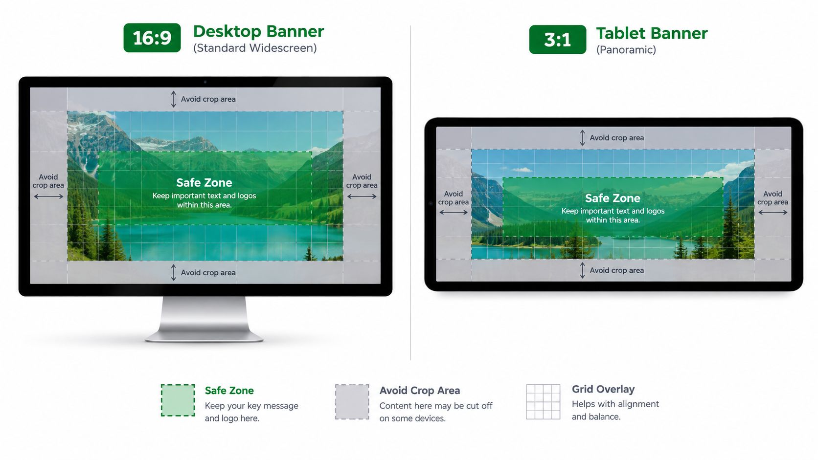
Build the safe zone into the file
Keep critical text, logos, and faces in the central area of the composition. Outer edges are vulnerable to responsive cropping, navigation overlays, and platform interface elements. A centered layout gives the same master artwork a better chance of surviving across surfaces.
Before publishing, preview the banner at desktop, tablet, and mobile widths. Tools such as Image Studio's social media resources can support platform planning, while this guide to social sharing images and Shopify SEO is useful when the asset also serves as a sharing image.
A single master can work across related placements only when the safe zone and focal point remain intact. If the mobile crop removes the product or offer, create a true mobile composition instead of shrinking the desktop file.
File Size, Compression, and LCP Tradeoffs
Pixel dimensions and file weight are separate decisions. A 1920-pixel image can be efficient, while a smaller image can still be heavy if it contains unnecessary metadata or uses an inefficient format.
HubSpot's guidance suggests keeping hero images under 500KB and testing widths up to 2560 pixels for high-density displays, as described in its hero image guidance. Other current recommendations use stricter caps such as 300KB or 150KB, so the useful operating range depends on the artwork, device mix, and whether the banner is the LCP candidate.
A crisp hero that arrives late is not a successful hero. Compress until the visual difference is hard to find, then measure the page.
Photographic banners usually respond well to careful JPEG or WebP compression. Remove unused metadata, inspect the edges of text overlays, and compare the compressed output on an actual phone. Don't judge only from a large design monitor, where minor artifacts are easier to miss.
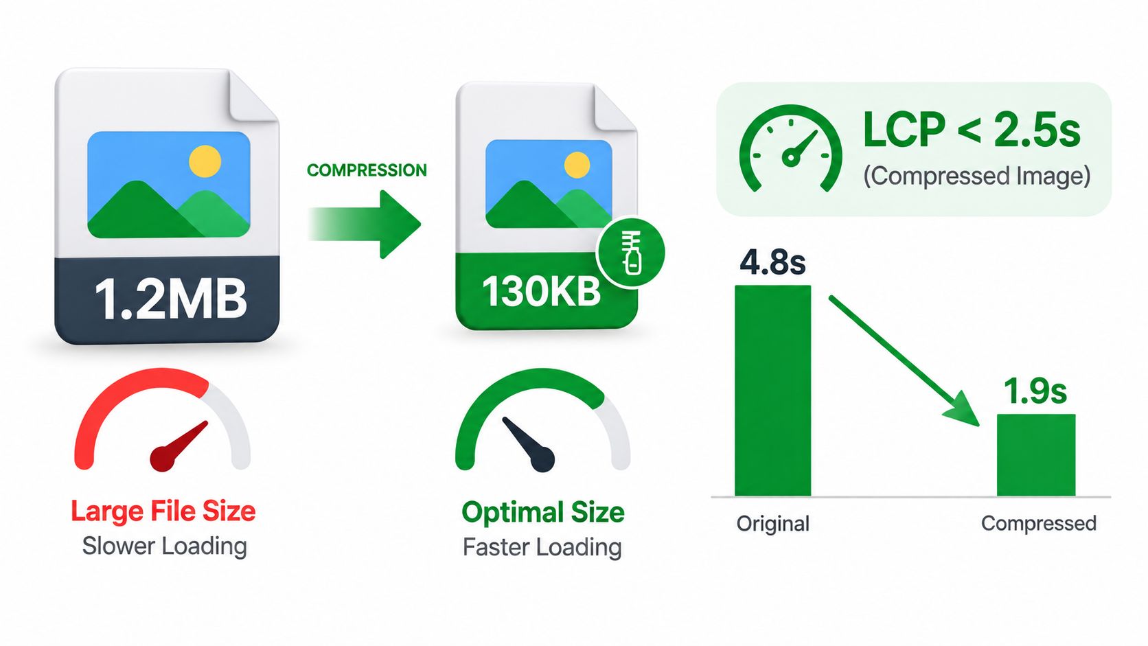
The source graphic illustrates an aggressive compression example, but those figures describe the visual, not a universal result you should promise for every store. Your own validation should compare the original and optimized files, then check mobile performance with the banner in its real theme section.
For implementation detail, use the workflow in image optimization for websites. Shopify's CDN and theme pipeline can help, but they can't rescue an unnecessarily oversized source or a poorly chosen mobile crop.
A useful test sequence is to publish a compressed candidate, run a mobile Lighthouse audit, inspect the LCP element, and compare the result with the uncompressed version. If the banner is above the fold, load it early. If it appears lower on the page, prioritize not competing with the actual first-screen content.
Responsive Delivery With Srcset and Lazy Loading
Responsive delivery starts with art direction, not just file resizing. A desktop hero may show a model beside the headline, while the mobile composition needs the model above the copy. The <picture> element handles that change more cleanly than a single srcset list.
Create a master, then produce variants that match the actual layout. A useful set can include a 1600-pixel desktop wide, 800-pixel tablet wide, 640-pixel mobile wide, and a square 800 × 800 option for portrait-oriented phone layouts. Those dimensions should follow the theme's slots, not become a rigid requirement for every store.
| Breakpoint | Source Width | Media Query | sizes Attribute |
|---|---|---|---|
| Large desktop | 1600 px | min-width: 1024px |
100vw |
| Tablet | 800 px | min-width: 768px |
100vw |
| Mobile landscape | 640 px | min-width: 480px |
100vw |
| Small mobile | Theme-specific | Default source | 100vw |
For a full-bleed hero, sizes="100vw" tells the browser that the image occupies the viewport width. For a constrained section, use a value such as sizes="(max-width: 768px) 100vw, 1600px" so the browser doesn't fetch a source larger than the rendered slot.
The loading rule is straightforward:
- Above the fold: load eagerly and consider
fetchpriority="high"for the actual LCP candidate. - Below the fold: use
loading="lazy"anddecoding="async". - Multiple crops: use
<picture>when the composition changes, not merely when the resolution changes.
Don't lazy-load the primary hero because a CDN is involved. Deferred loading can delay the element that defines LCP. Conversely, eager-loading every collection banner on a long page wastes requests before visitors reach those sections.
Writing Alt Text Banners Actually Need
Banner alt text should describe the information a visitor needs, not repeat a keyword. Merchants commonly make one of two mistakes: they leave meaningful promotional text inaccessible, or they fill a decorative image with unnecessary description.
If the banner communicates an offer, describe the offer directly. An alt value such as Free shipping on orders over $75, summer sale through July 31. conveys the visible message and its practical value. Don't start with “image of” or “photo of.” Lead with the promotion, product, or destination.
Decide whether the image carries meaning
Use descriptive alt text when the image contributes information that isn't already available as nearby HTML text. That includes a campaign message, a product-specific visual, or a clickable promotion whose meaning depends on the image.
Use alt="" when the banner is decorative or duplicates the heading and supporting copy beside it. An empty value lets assistive technology skip redundant content and keeps the page experience focused.
Keep the wording short enough to scan in a screen reader, while still naming the offer or subject. Don't add a year or season unless it appears on the artwork itself. For more examples and implementation guidance, see image alt text and SEO.
A good test is to remove the image and read the page. If the visitor loses an important offer, destination, or product detail, the alt text should preserve that meaning. If nothing meaningful is lost, decorative treatment is probably the cleaner choice.
Choosing the Right Image Format
Format selection depends on the artwork, transparency needs, and the theme's delivery support.
WebP is the practical default for many Shopify banners. Current guidance describes it as broadly supported, capable of transparent backgrounds, and commonly smaller than comparable JPEG output. It's a strong fit for photographic heroes, promotional graphics, and most mixed-content banners.
AVIF can produce smaller files at comparable visual quality, but Shopify themes must explicitly request it and some older browsers may not accept it. Use it when your theme and fallback logic are tested, not because the extension sounds newer.
JPEG remains dependable for photographic banners with gradients and no transparency. Its encoding behavior is familiar, and a JPEG fallback is useful when modern format negotiation fails.
PNG belongs on assets that need hard edges or transparency, such as logos and certain graphic overlays. It can become unnecessarily heavy for photographic artwork.
| Format | Best Use Case | Quality Setting | Transparency | Browser Support |
|---|---|---|---|---|
| WebP | General Shopify banners and mixed artwork | Around 75 to 82 for lossy output | Yes | Broad modern support |
| AVIF | Smallest tested output with explicit fallback | Around 60 | Theme and browser dependent | Requires validation |
| JPEG | Photographic banners without transparency | Around 80 to 85 | No | Very broad |
| PNG | Logos, hard edges, and required transparency | Lossless or tool-dependent | Yes | Very broad |
Keep one JPEG master in your assets folder even when WebP or AVIF is the delivery format. Theme updates, app changes, or negotiation logic can occasionally affect modern formats, and a fallback makes troubleshooting faster.
Pre-Publish Checklist for Banner Images
Run the checks in risk order. Fixing a focal point in the theme editor is more valuable than renaming a file after the banner has already been published.
Start with the theme
- Section height: Confirm the hero or collection section's desktop and mobile height settings.
- Focal point: Position the subject where the theme's crop will preserve it.
- Image swap: Check whether the section supports separate desktop and mobile assets.
- Overlay contrast: Verify that text remains readable over the image, not only the design mockup.
Clean the files
Use deterministic names such as summer-shoes-hero-desktop.webp. Keep names lowercase, remove spaces, and match the exported dimensions to the section's documented needs. Strip EXIF metadata unless it has a clear operational purpose.
Validate delivery
Inspect the rendered HTML and browser network panel. Confirm that responsive sources exist, the LCP hero loads eagerly, and below-the-fold banners use lazy loading. Check that WebP or AVIF variants have a working fallback rather than assuming the CDN handled every case.
Finish with SEO and QA
- Alt text: Describe meaningful promotional content without stuffing keywords.
- Structured data: Review schema when the banner carries an offer represented elsewhere on the page.
- Sitemap logic: Include the image in an image sitemap only when it represents indexable content.
- Viewport testing: Check desktop, tablet, and mobile crops.
- Performance audit: Run a mobile Lighthouse test and inspect the LCP element.
The final pass should happen on the live or preview theme, because an image can pass an asset review and still fail inside the actual section.
Frequently Asked Banner Image Questions
Should I upload a 2x retina banner?
Yes, but only when the theme consumes the extra pixels through responsive sources. A 3840-pixel-wide file served into a 1920-pixel slot can waste bandwidth if the theme doesn't select it intelligently.
Does Shopify's image CDN remove too much quality?
Shopify's default image processing is designed to balance quality and delivery weight. Test the rendered result at the theme's real dimensions before overriding settings, because a larger source won't compensate for a poor crop or excessive compression.
Can I use SVG for a banner?
SVG works well for decorative shapes, icons, and simple non-photographic artwork. A complex SVG hero can create rendering work and may hurt LCP, so use raster responsive images for photography or intricate campaign scenes.
RankEngine audits Shopify image assets for compression status, potential size savings, and alt-text coverage, then helps you identify banner issues alongside broader SEO controls. Visit RankEngine to review your store's image and technical SEO checks before your next campaign goes live.