 RankEngine
Most advice about how to change pixels size of picture starts with a resizer, a target width, and a download button. That workflow is incomplete for Shopify. The right output isn't just “smaller.” It must match the image's placement, preserve the product's proportions, remain sharp at the device's pixel density, and arrive in a format and byte size the browser can handle efficiently.
A product image in a collection card has different requirements from a zoom view or a mobile hero. Treating them as the same asset either wastes bandwidth or produces a visibly soft storefront. Pixel dimensions are therefore a responsive delivery decision, not just a file-editing task.
Table of Contents
- Why Pixel Dimensions Matter More Than File Size
- The Math Behind Resizing Images Accurately
- Pixel Dimensions Versus Compression Strategy
- How Responsive Slots and DPR Dictate Sizing
- Validating Resized Images for Performance and Quality
- Avoiding Common Sizing Mistakes in Shopify Themes
- Building a Repeatable Image Resizing Workflow
Why Pixel Dimensions Matter More Than File Size
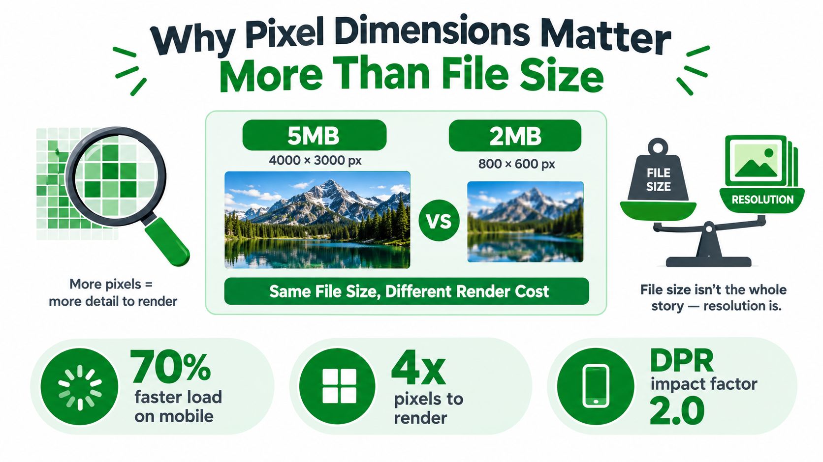
File size alone is a poor definition of image optimization. A compressed image can still contain many more pixels than its Shopify theme slot needs. The browser may download, decode, scale, and render detail that visitors never see at its native size.
The 2019 HTTP Archive Web Almanac media analysis found that the median site displayed about 1 megapixel of media content in its layout. At the 90th percentile, that reached 4.6 megapixels on mobile and 6.3 megapixels on desktop. The analysis also reported that media accounted for 44% of page bytes at the 10th percentile and up to 91% at the 90th percentile. Image delivery therefore affects the page as a whole, not just the visual quality of an individual product photo.
The rendering cost of excess pixels
A large original placed in a small Shopify card creates several types of waste:
- Network waste: The browser downloads bytes for pixels that will not appear at their original detail.
- Decode work: It reconstructs the full image before applying the visual scale.
- Rendering work: It resamples the image to fit the CSS box.
- Layout risk: Missing intrinsic dimensions or inconsistent aspect ratios can shift content while the media loads.
Pixel dimensions also affect how well the browser can reserve space and process an image during loading. They do not determine every Core Web Vital, but correctly sized assets support more efficient loading and more stable layouts. Google's image optimization guidance treats format, quality, resolution, and responsiveness as connected variables, rather than isolated controls.
Practical rule: Compressing an oversized image does not make it correctly sized. Match the pixel dimensions to the placement first, then encode the result efficiently.
Quality depends on the display context
Pixel count determines how much visual detail an asset can retain. A 1,600 × 1,200 image contains 1.92 million pixels, while an 800 × 600 derivative contains 480,000 pixels, a 75% reduction that preserves the original 4:3 shape. That smaller derivative is appropriate when it matches the rendered slot. It becomes unsuitable if the theme later enlarges the same file for a prominent zoom view.
Shopify themes commonly reuse product media across collection cards, product galleries, mobile layouts, and zoom interfaces. Each placement can require a different derivative. Device-pixel ratio also matters: a slot that appears small in CSS may need more source pixels on a high-density screen to remain sharp.
There is no universal ideal image size. The right target is the smallest source that stays clear at the largest intended display density, while avoiding pixels the browser will immediately discard through scaling. That placement-aware choice connects image dimensions directly to page speed, merchandising detail, and the theme's responsive behavior.
The Math Behind Resizing Images Accurately
Start with the source dimensions, not the editor's visual frame. If the original width is (W_s), the original height is (H_s), and the target width is (W_t), calculate the proportional target height with:
[
H_t = W_t \times H_s / W_s
]
For a 1,600 × 1,200 source resized to 800 pixels wide, the calculation is:
[
800 \times 1,200 / 1,600 = 600
]
The correct derivative is therefore 800 × 600, not an arbitrary height entered to fit a design box. Both versions retain a 4:3 aspect ratio, so the product isn't stretched.
Resize the pixels, not only the box
Changing CSS from a large image to width: 400px changes the display box. It doesn't necessarily reduce the intrinsic file delivered to the browser. The HTML and CSS may make an image look small while the page still downloads the full original.
A proper derivative changes the actual pixel data. Keep the original master, calculate the target dimensions, and generate the output from that master with a quality resampling filter. ImageMagick's resize documentation describes explicit column and row resizing with selectable filters, including Lanczos in many default configurations.
Downscaling and upscaling aren't equivalent
Reducing an image removes pixel positions. Enlarging one creates output positions that weren't present in the source, so software estimates missing information through interpolation. An 800 × 600 image enlarged to 1,600 × 1,200 has four times as many output pixel positions, but it doesn't recover the original detail.
For photographs, a high-quality smoothing filter usually produces the most natural reduction. For pixel art, diagrams, or screenshots with hard-edged blocks, nearest-neighbor or point sampling avoids the soft anti-aliased edges created by smoothing. Resize once from the original whenever possible. Repeatedly resizing an already-resized derivative compounds blur, ringing, and other interpolation artifacts.
| Operation | What changes | Main risk |
|---|---|---|
| Proportional downscaling | Fewer actual pixels | Fine detail may disappear if the target is too small |
| Non-proportional resizing | Width and height change independently | Products and people look stretched |
| Upscaling | New pixel positions are estimated | Blur and artificial detail |
| CSS-only scaling | Display box changes | The browser may still download the oversized original |
The correct workflow is simple in principle: inspect the source, identify the largest real placement, calculate proportional dimensions, resize from the master, and compare the result at the intended display size.
Pixel Dimensions Versus Compression Strategy
Pixel dimensions and compression solve separate delivery problems. Resizing determines how many pixels the browser must decode and render. Compression determines how efficiently those pixels become bytes. A photograph can be highly compressed and still burden a phone if its raster is far larger than the Shopify slot displaying it.
The same 2019 Web Almanac analysis cited earlier shows why both decisions matter. JPEG represented 60% of image requests and 65% of image bytes, while a median image transfer at one distribution point was about 916 KB. Treat those figures as context, not a universal target. They indicate how readily images can dominate page transfer and affect metrics such as Largest Contentful Paint.
A two-pass decision
Set the image dimensions before choosing compression settings:
- Match the placement. Measure the rendered width at relevant breakpoints and allow for the device-pixel ratio.
- Encode the derivative. Choose the format, quality level, transparency handling, and metadata policy that fit the image and its role.
- Inspect the delivered file. Compare visual detail, intrinsic dimensions, and byte size instead of trusting an export preset.
Google recommends evaluating JPEG quality around 85 or lower, because file sizes can rise quickly above 85 with limited visible improvement. It also recommends 4:2:0 chroma subsampling when reduced colour detail is unlikely to be noticed. These are testing points, not fixed rules. Product images containing fine coloured text or crisp edges may need different settings.
Shopify themes can request an image variant while the catalogue still holds oversized originals. Compression cannot determine whether a product card needs a thumbnail, a gallery image, or a zoom asset. The layout and merchandising workflow must define that role first. Use the best web image practices guide for a broader comparison of formats and implementation choices.
How Responsive Slots and DPR Dictate Sizing
A Shopify theme doesn't display “the product image.” It displays an image inside a slot. That slot may be a grid card, a collection tile, a gallery panel, a mobile carousel, or a zoom layer. Each slot can have a different CSS width at different breakpoints, so exporting one universal file creates predictable compromises.

Calculate from the rendered slot
Device Pixel Ratio, or DPR, describes the relationship between CSS pixels and the physical pixel density used by a display. A 400 CSS-pixel slot on a 2x display may need roughly 800 source pixels for crisp rendering. The same 800-pixel asset sent to a narrow 1x phone can be wasteful if the phone's slot is much smaller.
Use this decision sequence:
- Measure the slot: Inspect the live theme at mobile, tablet, and desktop widths. Record the rendered CSS width for cards, tiles, and prominent placements.
- Estimate DPR demand: Multiply the slot width by the likely DPR. A 400 CSS-pixel slot at 2x points toward an 800-pixel source.
- Cap useful output: Don't create a derivative larger than the largest placement needing it.
- Separate crops when needed: If mobile changes from a horizontal composition to a square or portrait composition, generate a deliberate crop instead of distorting the original.
MDN's responsive image guidance defines the w descriptor as each candidate's intrinsic pixel width. In practice, srcset and sizes let the browser choose among dimension-specific candidates instead of receiving one oversized file at every viewport.
Make the browser's choice explicit
A simplified pattern might associate several real derivatives with the same image. The sizes value should describe the slot the theme creates, while each srcset candidate should identify its intrinsic width. Don't guess these values from the product image's original dimensions. Inspect the rendered theme and verify the selected resource in browser developer tools.
The same source can therefore need separate outputs for:
- A compact product card.
- A wider collection tile.
- A mobile gallery.
- A desktop gallery.
- A high-density zoom view.
The aim isn't to maximize resolution. It's to deliver enough source pixels for the current slot, with alternate candidates available when the slot changes.
A short visual demonstration can help teams connect responsive layout behavior with asset selection:
Validating Resized Images for Performance and Quality
A resized export is ready for production only after two checks: inspect the derivative itself, then test it inside the live Shopify theme. The acceptance test must cover the resource the browser downloads and the image a customer sees.
Check the final file
Confirm these properties before uploading:
- Intrinsic dimensions: Verify the exported width and height, not just the CSS box.
- Aspect ratio: Confirm that the product is neither stretched nor unintentionally cropped.
- Encoded format: Check that the format supports the image's transparency and detail requirements.
- Color profile: Make sure colors remain consistent between editing tools and the storefront.
- Transparency behavior: Verify that transparent backgrounds render correctly.
- Byte size: Compare the derivative with the source and with other candidates for the same slot.
- Metadata: Inspect EXIF fields and remove unnecessary GPS, device, capture-time, and software information before publication.
Quality settings depend on format, resolution, and the image's visual role. Test JPEG photographs across a sensible quality range, then judge the result at the largest intended rendered size instead of applying one fixed setting to every product.
Acceptance test: At 100% zoom, check for important cropping, visible distortion, new halos, block artifacts, and loss of small product text. At the largest intended rendered size, the image should remain sharp enough for the shopping task.
Explicit image dimensions also matter during validation. Confirm that the final width and height, or an equivalent aspect-ratio rule, reserve the intended space and prevent layout movement as the image loads. Web performance guidance on image aspect ratios and explicit dimensions provides a useful reference for this check.
Inspect visible privacy risks
Metadata removal does not make a photograph safe by itself. Resizing leaves faces, documents, usernames, reflections, street signs, and screen text visible when they remain in the pixels. Preserve the original privately, create a derivative copy, inspect edges and reflections, remove unnecessary EXIF fields, and verify the exported file rather than trusting an editor preview.
For bedding, furniture, and other visually detailed catalogs, this image workflow for mattress retailers offers practical context for organizing quality and publishing checks without reducing the process to compression alone.
Test the browser behavior
Open the product page at the largest intended rendered size and on a high-density display. Inspect the selected srcset candidate, confirm that the theme requests an appropriate derivative, and check whether it loads an unnecessarily large original. Review the browser's performance tools for image transfer, decoding, and layout behavior alongside the visual result.
The strongest result combines lower transfer and decode work with intact product detail. A smaller file that blurs a fabric weave or removes important product text creates a merchandising defect, not an optimization win.
Avoiding Common Sizing Mistakes in Shopify Themes
The most damaging Shopify image mistake is exporting every asset to one universal dimension. A product card, gallery, mobile hero, and zoom view don't share the same slot, so one file will either be too small for the largest placement or too large for the smallest one.
Blindly enlarging a small source doesn't restore detail. It creates more output pixel positions through interpolation, which can leave products soft. Blindly serving a large original inside a small CSS box creates the opposite problem, unnecessary download, decode, and rendering work.
Common failures and their fixes
- Forced dimensions: Setting unrelated width and height values stretches products. Calculate the proportional height from the source ratio.
- CSS-only resizing: A small visual box can still deliver the full original. Generate a real derivative and verify the requested URL.
- Repeated edits: Resizing a derivative repeatedly compounds blur and ringing. Return to the original master.
- One-file catalogs: A single asset can't serve every breakpoint efficiently. Create deterministic variants for the actual theme slots.
- Unplanned cropping: A safe desktop crop can remove the product on mobile. Use alternate crops when the aspect ratio changes.
- Metadata assumptions: Resizing doesn't remove visible sensitive content and may leave EXIF fields intact. Inspect both the pixels and the final file.
A banner deserves its own placement analysis rather than a product-card rule. The Shopify banner image size guide can help frame that distinction, but the live theme remains the authority. Inspect the actual rendered slot before defining a derivative specification.
Building a Repeatable Image Resizing Workflow
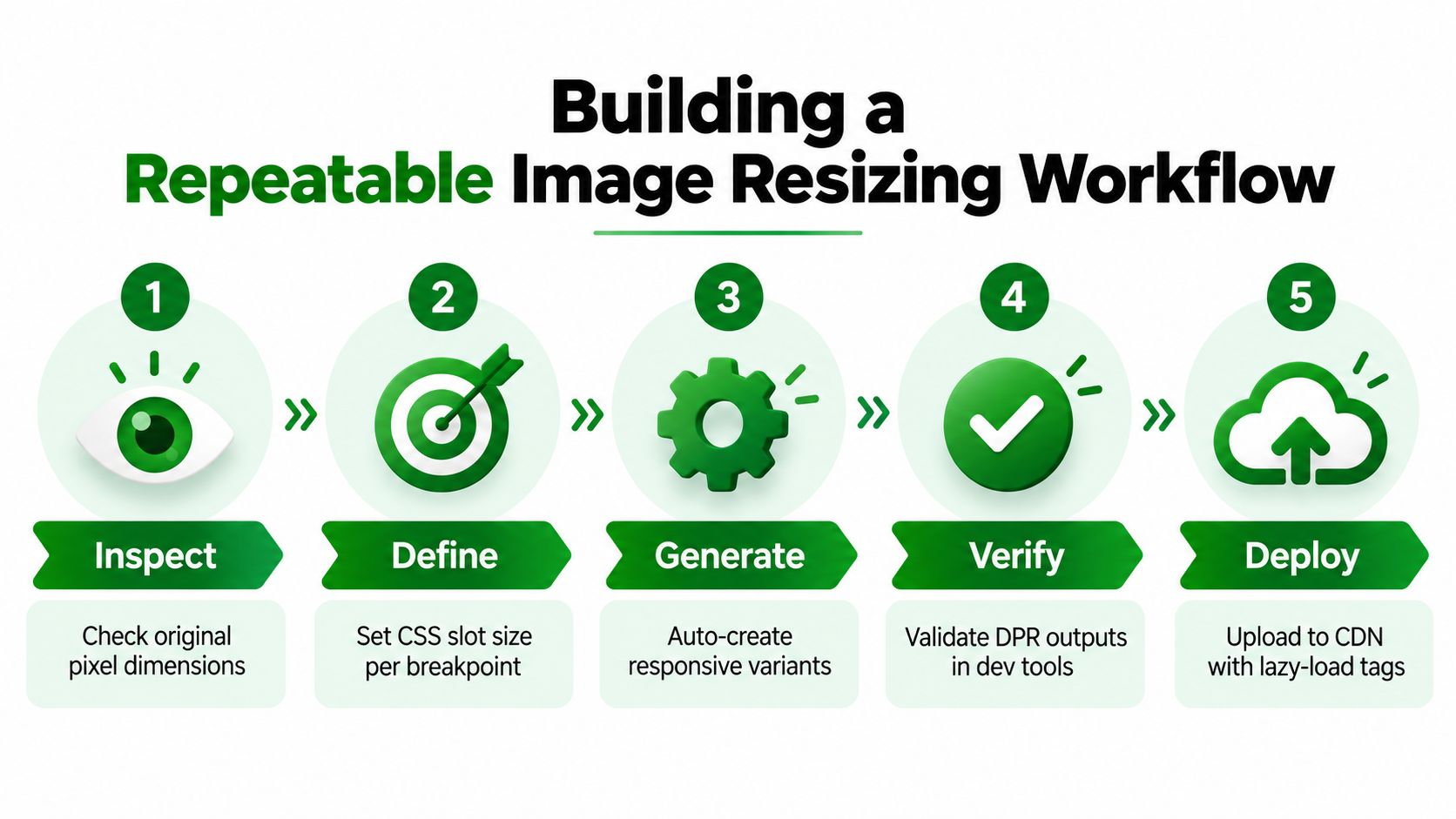
A reliable catalog process turns image sizing into documented production data. Keep the original master, record its dimensions, and generate derivatives from that master rather than editing files manually until they look approximately right.
Use a slot specification
For each theme placement, record:
- Inspect: Capture the original width, height, aspect ratio, format, profile, transparency, and metadata.
- Define: Measure the CSS slot at each breakpoint and account for likely DPR.
- Generate: Calculate proportional dimensions, create alternate crops where composition changes, and resize once from the master.
- Verify: Check the selected candidate in browser developer tools, then inspect sharpness, cropping, color, metadata, and bytes.
- Deploy: Upload the approved derivatives, preserve aspect-ratio behavior, and ensure noncritical images use the theme's intended lazy-loading approach.
ImageMagick works well for deterministic batch generation because the resize operation accepts explicit dimensions and a selected filter. Use smoothing for ordinary photographs, but choose nearest-neighbor or point sampling for pixel art, diagrams, and screenshots where hard edges must remain hard.
Teams producing many catalog assets can pair this technical process with a product photography automation guide, provided the automation preserves the original master and records the derivative rules. Automation should make decisions reproducible, not hide them.
For Shopify operators who want image checks alongside broader store diagnostics, Shopify image optimization app guidance can help identify where compression, dimensions, and delivery need attention. RankEngine's image workflow includes image optimization insights and an Auto Image Compression rule that converts oversized Shopify product images to WebP and replaces the original through Shopify's Admin API. Treat that as one part of the process, not a substitute for measuring theme slots and validating visual output.
The practical standard is straightforward: every published image should have a known source, a defined placement, a proportional dimension calculation, a documented output format, and a live rendering check. That discipline prevents the two expensive errors in ecommerce media, blurry product presentation and oversized delivery.
RankEngine audits Shopify images for dimension and compression issues, tracks per-image action history, and verifies supported changes against the live store. Visit RankEngine to connect image optimization with broader Shopify SEO and answer-engine readiness checks before your next catalog update.