 RankEngine
Images account for nearly half of the median webpage's transfer size, and they're also the web's largest asset category by total bytes and request count, according to web.dev's responsive-image guidance. That reframes the “best web image” question. The winner isn't a single file format. It's the smallest image that preserves the intended quality, matches the visitor's layout and device, loads at the right moment, and gives search engines enough context to understand it.
For a Shopify merchant, image performance is a deployment problem. Format selection matters, but so do responsive source sets, intrinsic dimensions, compression settings, CDN behavior, loading priority, alt text, structured data, and the decision to remove images that don't contribute to the buying experience. A product page can use AVIF, WebP, and JPEG correctly and still perform poorly if it sends a desktop-sized hero to a phone or lazy-loads the main product image.
The practical approach is to build a repeatable image pipeline. Choose the format by content type, generate suitable variants, serve the right width, reserve space before loading, prioritize the visible image, and make every meaningful asset discoverable.
Table of Contents
- Why Images Drive Web Performance
- Comparing AVIF, WebP, JPEG, PNG, and SVG
- Responsive Images That Match Every Device
- Sizing, Dimensions, and Loading Priority
- Compression, Encoding, and CDN Delivery
- Image SEO and Structured Data Essentials
- Common Image Mistakes That Hurt Rankings
- Your Image Optimization Checklist
Why Images Drive Web Performance
A median webpage transfers roughly 2 MB, with images making up nearly half of that amount, according to a responsive-images primer on ImageEngine. For a Shopify storefront, that payload often comes from product photography, collection tiles, promotional banners, recommendation cards, logos, and editorial media. Image performance is therefore a deployment problem, not a search for one universally best file.
A web-scale study of 435M images shows why format debates need context. AVIF and WebP adoption is accelerating, while JPEG still dominates. The practical conclusion is not to replace every JPEG immediately. Choose an encoding stack by content type, browser support, encoding cost, and the byte savings a visitor will actually receive.
During an audit, I start with the largest visible image and the largest repeated image type. A merchant may spend time removing a small script while a hero photograph remains several times larger than the space where it appears. The script can matter, but correcting that oversized image is often the more direct performance improvement.
Why the first image deserves special treatment
The image in the initial viewport often becomes the page's Largest Contentful Paint candidate. A large file that the browser discovers late, downloads, decodes, and paints can delay the moment the page feels complete. Mobile connections and lower-powered devices make that delay easier to notice.
Images also influence Cumulative Layout Shift. Without known proportions, the browser cannot reserve the correct space before an image arrives. Content can then move, causing a customer to lose their place while selecting a product option or reaching the add-to-cart button.
The remedy is a coordinated stack:
- Format: Match photographs, logos, icons, and transparent graphics to suitable encodings.
- Sizing: Generate variants for the widths the storefront renders.
- Markup: Use
srcset,sizes, andpicturewhen they offer meaningful source choices. - Dimensions: Declare intrinsic width and height so the browser can reserve space.
- Priority: Load the visible, meaningful image early and defer offscreen media.
- SEO context: Provide descriptive filenames, alt text, and structured data for important images.
A fast image is not the sharpest file in the media library. It is the file that preserves appropriate visual quality for the visitor's viewport without sending avoidable bytes. Compression, encoding time, decoding work, and fallback support all belong in the decision. That principle keeps format selection tied to the storefront's content and delivery conditions.
Comparing AVIF, WebP, JPEG, PNG, and SVG
Format choice should follow the image, not fashion. A product photograph has different needs from a logo, an interface icon, or a transparent promotional graphic. The modern stack usually offers a preferred format plus fallbacks, rather than forcing every browser and every asset into one encoding.
What each format does well
AVIF usually delivers the strongest compression among the photographic formats discussed here. Chrome's Lighthouse guidance notes that AVIF can produce greater than 50% savings compared with JPEG in some cases, while preserving useful visual quality. The trade-off is operational. AVIF encoding can take longer, and decoding may be slower on low-powered devices, so it should earn its place on pages where the byte reduction matters.
WebP is the pragmatic modern default for many storefronts. It supports lossy and lossless compression, transparency, and animation, and it generally compresses more effectively than older JPEG, PNG, and GIF workflows. It offers a strong balance between payload size, browser support, and processing throughput.
JPEG remains valuable as a fallback. It's widely supported, works well for photographs, and has a mature toolchain. It doesn't support transparency, so it isn't suitable for every catalog graphic.
PNG is useful when lossless detail or an alpha channel matters. Logos, interface graphics, and screenshots with sharp edges may need it, although a photographic PNG can become unnecessarily heavy.
SVG belongs to a different category. It's a vector format for logos, icons, diagrams, and other shapes that need to remain crisp at multiple display sizes. It isn't a replacement for detailed product photography.
A large web-scale study of 435 million images found that JPEG and PNG still dominate many sites, while WebP and AVIF adoption is accelerating. The study reports WebP rising from 2.4% of images in 2022 to 16.6% in 2026, and AVIF rising from 0.1% to 4.3% over the same period, as documented in the study's format analysis. Those figures describe adoption, not a command to replace every asset immediately.
A production decision table
| Format | Compression | Transparency | Animation | Browser Support | Best For |
|---|---|---|---|---|---|
| AVIF | Excellent, with higher encoding cost | Yes | Yes | Modern browsers, fallback needed | High-impact photographs |
| WebP | Strong and practical | Yes | Yes | Broad modern support | General catalog imagery |
| JPEG | Mature lossy compression | No | No | Very broad | Fallback photographs |
| PNG | Lossless, often heavier | Yes | No | Very broad | UI graphics and transparency |
| SVG | Compact for vector shapes | Yes | Limited | Broad, with security controls | Logos, icons, and diagrams |
For Shopify product photography, I'd normally offer AVIF first, WebP second, and JPEG last. That arrangement lets capable browsers take the efficient path while older environments still receive a usable file. PNG and SVG should be selected by content requirements, not because a platform happens to accept them.
Responsive Images That Match Every Device
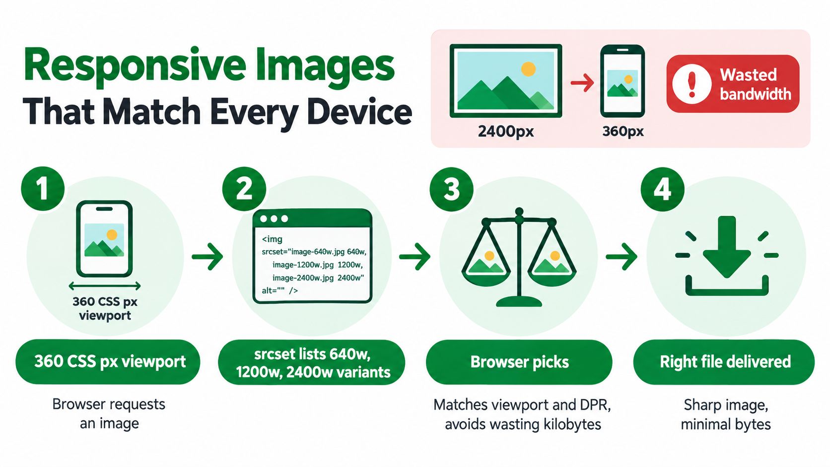
A 2,400-pixel image delivered into a 360 CSS pixel phone layout contains detail the visitor can't use at that display size. web.dev explains that sending desktop-sized images to mobile devices can consume 2–4x more data than necessary. Responsive delivery prevents that waste before the browser starts downloading the file.
The core tool is srcset. You provide multiple files at different widths, and the browser selects the most suitable candidate based on the rendered space and device pixel ratio.
<img
  src="product-960.jpg"
  srcset="
    product-320.jpg 320w,
    product-480.jpg 480w,
    product-640.jpg 640w,
    product-960.jpg 960w,
    product-1280.jpg 1280w,
    product-1920.jpg 1920w
  "
  sizes="(max-width: 749px) 92vw, 50vw"
  width="960"
  height="960"
  alt="Sage linen shirt front view">
The sizes value tells the browser how wide the image will render. It shouldn't just repeat the device's screen width. A product image may occupy most of a phone viewport but only half the desktop content area, so the layout signal needs to reflect that.
When the crop should change
Use <picture> when mobile and desktop need different compositions, not merely different widths. A wide desktop banner might show a model's full outfit, while a square mobile crop keeps the product visible in a narrower layout.
<picture>
  <source
    media="(max-width: 749px)"
    srcset="hero-mobile.avif"
    type="image/avif">
  <source
    srcset="hero-desktop.avif"
    type="image/avif">
  <img
    src="hero-desktop.jpg"
    alt="Sage linen collection in a bright studio">
</picture>
A practical width ladder can include 320, 480, 640, 960, 1280, 1920, and 2560 pixels. Those candidates cover small cards through wide displays without requiring an uncontrolled collection of near-duplicate exports. Your theme's actual containers should decide which candidates remain necessary.
For a visual explanation of banner dimensions and layout context, see this guide to banner image size. The important point is that responsive images are markup and delivery behavior, not a CSS afterthought.
When you combine responsive sizing with format negotiation, place AVIF sources first, WebP sources next, and JPEG fallback last. The browser can then choose a supported format and an appropriate width without JavaScript deciding which file to download.
Sizing, Dimensions, and Loading Priority
A browser can't infer the correct rendered size from the source file alone. It needs layout information. If a product image is displayed in a 600-pixel container but the page sends a 4,000-pixel original, the browser still downloads and decodes the oversized asset before displaying only part of its available detail.
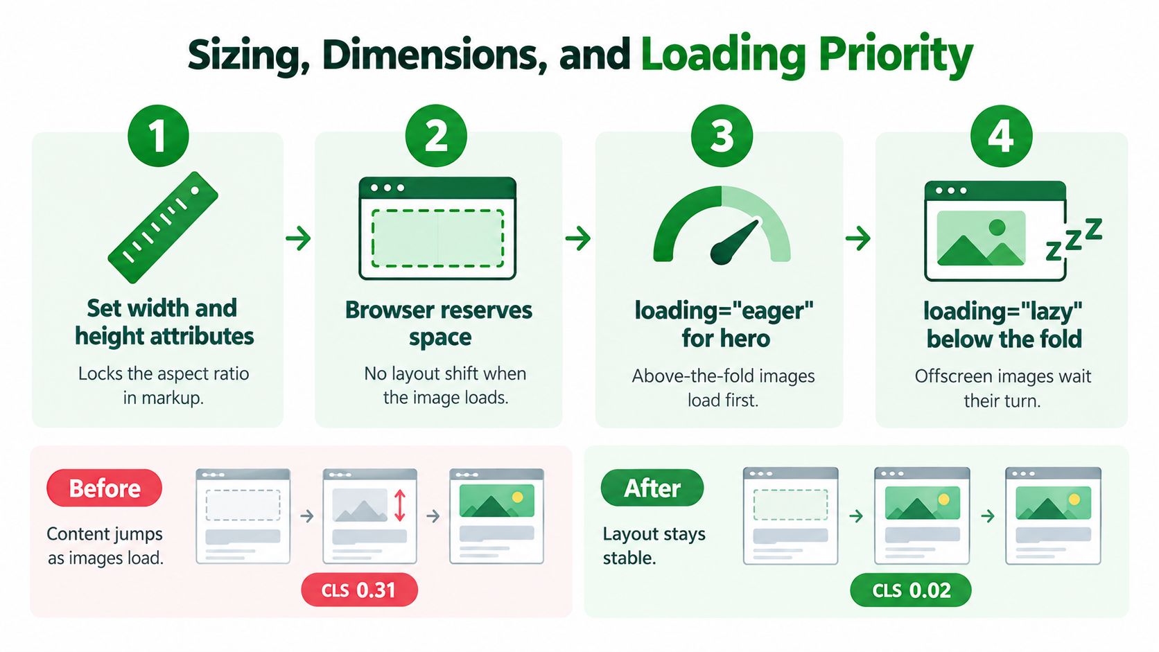
The same source can also create instability if its dimensions aren't declared. Add matching width and height attributes to content images, as recommended in MDN's multimedia performance documentation. These values let the browser calculate the aspect ratio and reserve space before the response arrives.
<img
  src="product-800.webp"
  width="800"
  height="800"
  loading="eager"
  fetchpriority="high"
  decoding="async"
  alt="Sage linen shirt front view">
The attributes have different jobs. width and height help prevent CLS by reserving the image box. fetchpriority="high" can help the browser identify a visible hero or main product image as important. loading="lazy" should be used for gallery items, recommendation cards, and other media below the initial viewport.
Match each setting to the problem
- Oversized source: Reduce the requested width through
srcsetandsizes. This targets transfer size and helps LCP. - Unknown aspect ratio: Add intrinsic dimensions. This targets CLS and protects nearby controls from movement.
- Late hero discovery: Keep the LCP candidate in the initial markup and use an appropriate priority hint. This targets the time before the main visual paints.
- Offscreen gallery: Apply native lazy loading. This preserves early network capacity for visible content.
Don't lazy-load every image by default. A hero image that waits until the browser treats it as near the viewport can arrive later than necessary. Conversely, loading every gallery image eagerly makes the first view compete with content the customer hasn't requested yet.
Practical rule: Give the first meaningful image a clear size and high priority. Give everything below the fold a reason to wait.
Use decoding="async" when you want image decoding to avoid blocking the main rendering path, but treat it as a supporting hint rather than a substitute for correct dimensions and source selection. The biggest gains come from asking the browser to download the right asset in the first place.
Compression, Encoding, and CDN Delivery
Compression works best as a controlled workflow. Keep a high-quality master outside the storefront, then create delivery variants for the actual placements. A source file should remain useful for future crops and redesigns, while the browser should receive an encoded asset built for its current layout.
Start with format conversion and resizing, then inspect the result at the rendered size. A smaller file isn't automatically better if compression creates visible ringing around text, muddy product texture, or blocky edges that reduce purchase confidence. For photographs, compare the encoded result against the master at the size customers see, not only at extreme zoom.
Let delivery infrastructure automate variants
A CDN or image service can generate AVIF, WebP, and JPEG responses from one uploaded source. It can also resize by requested width, strip unnecessary metadata, cache variants, and negotiate formats through request headers. That keeps merchants from manually exporting every combination whenever a theme changes.
Services differ in how much of that work they automate:
| Service | Auto-Format Negotiation | On-the-Fly Resizing | Pricing Model |
|---|---|---|---|
| Cloudflare Images | Available through image delivery features | Available through image transformations | Service and delivery usage plans |
| imgix | Yes | Yes, with extensive URL transformations | Usage-based image processing and delivery |
| Bunny Optimizer | Supports automated optimization features | Supports resizing and optimization | CDN and optimization usage plans |
Check current service terms before selecting a provider because pricing, transformation limits, and format support can change. For a Shopify merchant, the best operational setup is the one that receives a source image, applies predictable transformations, serves the right response, and gives you enough visibility to diagnose failures.
The guide to making a photo smaller is useful for manual workflows, but a large catalog needs automation. If staff members must remember compression settings for every upload, inconsistent output is almost guaranteed.
Preserve quality while reducing waste
Metadata such as camera information and editing history rarely helps a storefront visitor. Removing it can reduce payloads, while the visual encoding should be tested against the product's detail requirements. Progressive JPEG remains a useful fallback technique for larger photographic files, although a modern AVIF or WebP response may be preferable when the browser supports it.
Don't choose an encoding policy by chasing the smallest possible file. Measure the image in context, compare it on mobile hardware, and keep a fallback for browsers or workflows that don't handle the preferred format reliably.
Image SEO and Structured Data Essentials
A 435 million-image web-scale study shows why there is no single winning image format. AVIF and WebP adoption is accelerating, while JPEG still dominates. For SEO, the better question is how each asset is deployed: the right format, dimensions, metadata, page context, and browser fallback for that content type.
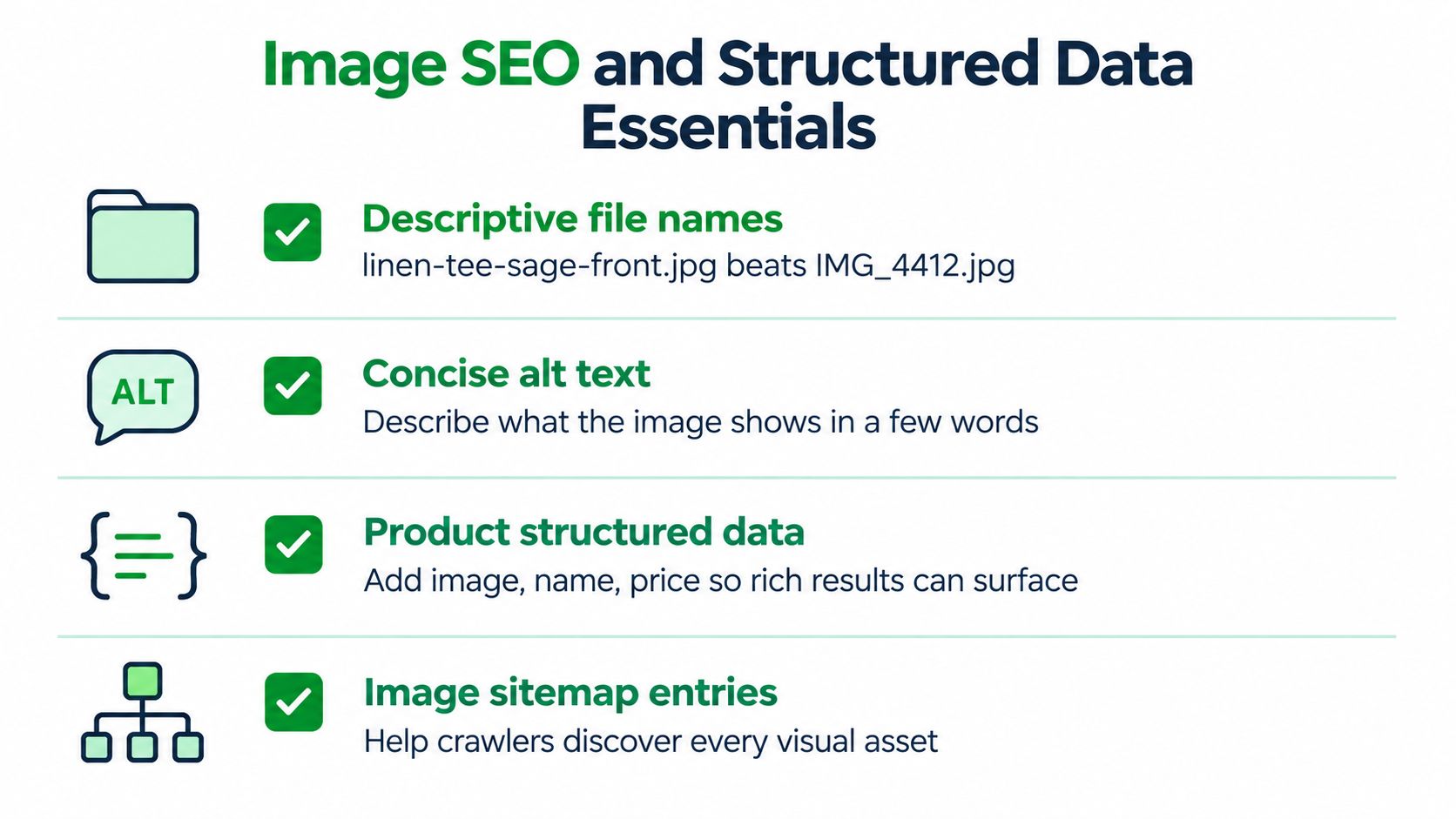
Performance makes an image easier to use, but context makes it easier to discover. Google's image-search guidance identifies alt text as useful metadata for search and for screen-reader users. It also helps people on low-bandwidth connections understand what an image communicates.
A product photograph should use a filename such as linen-tee-sage-front.jpg, not IMG_4412.jpg. The filename gives people and search systems a clue before they inspect the pixels. Keep it descriptive rather than turning it into a keyword list, and do not claim details the image does not show.
Write alt text for the image's role
Alt text should be concise and specific. For a product image, describe the item and the view. A decorative divider or background texture may need an empty alt value, so assistive technology does not announce content with no useful meaning.
Give each meaningful gallery image its own description. “Sage linen shirt front view,” “Sage linen shirt side view,” and “Sage linen shirt fabric detail” provide different information to a screen-reader user and help search systems distinguish the assets. For a full walkthrough, see this guide to image alt text SEO.
Add machine-readable product context
On product pages, structured data can identify the product and associate relevant image URLs with it. An ImageObject may include contentUrl, width, height, and thumbnailUrl. Keep product structured data consistent with the visible page and the actual offer.
Image sitemaps provide another discovery path for assets crawlers may not reach through ordinary page links. They do not fix blocked resources, misleading metadata, or poor page relevance, but they make a catalog's visual inventory clearer.
RankEngine includes image audits and an Image Alt Text Generator and Checker for Shopify products and collections, covered in our alt-text guide. It checks existing alt text for length, redundancy, and keyword stuffing, and supports adding alt text through the product media workflow. Use it alongside Shopify's native editing tools and structured-data validation.
Common Image Mistakes That Hurt Rankings
More images don't automatically create a better shopping experience. During storefront audits, the recurring problem is usually not a lack of visual material. It's that the store sends too much of the wrong material at the wrong time.
A hero may be exported at a desktop resolution even though the theme displays it in a much smaller container on phones. A gallery may include every original photograph when the customer only needs a few useful angles. A decorative banner may add requests and bytes without helping the visitor understand the product or complete a purchase.
The failures that appear most often
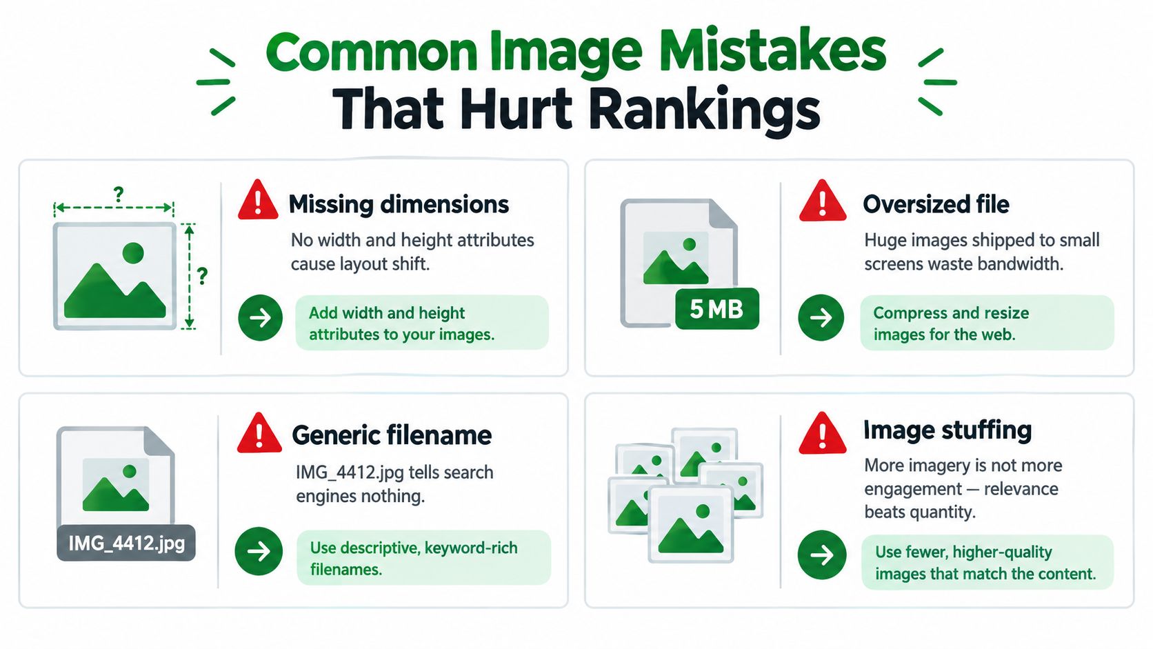
- Missing dimensions: Without
widthandheight, the browser may not reserve the correct space, which can cause layout movement and weaken CLS. - Oversized hero assets: Sending a huge source to a small viewport wastes bandwidth and can delay LCP.
- Lazy-loading the visible image: Applying
loading="lazy"to the main above-the-fold image can postpone the asset that should paint first. - Generic filenames: Names such as
IMG_4412.jpgprovide little descriptive context for users or search systems. - Gallery overload: Repeated or near-identical images create more work for the browser and can dilute the value of the visual content.
- Decorative excess: Background images and promotional flourishes can consume resources without supporting navigation, comprehension, or conversion.
Fix subtraction before adding features
A common response to weak engagement is to add more lifestyle photography, more carousel slides, or more recommendation tiles. That can make the page heavier without addressing the underlying issue. First ask whether each image earns its place by clarifying the product, proving quality, showing use, or helping the customer compare options.
Duplicate visual assets can also create confusion in image search when several URLs represent effectively the same image. Use canonical page relationships, consistent product data, meaningful filenames, and a deliberate gallery structure so search engines can identify the primary context.
A useful audit question: If removing an image wouldn't make the product harder to understand, test removing it.
The best web image strategy is therefore a subtraction exercise first. Remove unnecessary assets, reduce oversized requests, and stop delaying the meaningful image. Only then add new visual content where it improves the customer's decision.
Your Image Optimization Checklist
Treat image optimization as a pipeline, not a one-time export. The checklist below is designed for a Shopify sprint, with each action tied to the outcome it can influence.
| Stage | Action | Target Outcome |
|---|---|---|
| Content planning | Choose the format by content type | Appropriate quality and payload |
| Source preparation | Export from a clean master with intrinsic dimensions | Consistent rendering and stable layout |
| Encoding | Generate AVIF and WebP, retain a JPEG fallback | Modern delivery with compatibility |
| Responsive markup | Define srcset and accurate sizes values |
Smaller requests on constrained layouts |
| Above-the-fold delivery | Set high priority on the LCP candidate | Earlier main visual paint |
| Below-the-fold delivery | Lazy-load galleries and recommendation images | More bandwidth for the first view |
| Accessibility | Write unique, descriptive alt text | Better screen-reader experience and image context |
| Discovery | Maintain image sitemap and structured data entries | Easier crawling and richer understanding |
| Validation | Test with PageSpeed Insights and Rich Results Test | Confirm performance and search eligibility |
| Monitoring | Review catalog output after theme and device changes | Policy stays aligned with the live store |
Start with one template, such as the product page. Identify the main image, inspect its rendered dimensions, check the requested format and width, confirm the browser reserves space, and then review the gallery's loading behavior. Apply the same logic to collection cards and homepage promotional modules rather than copying one setting everywhere.
Run a fresh audit after major theme changes, catalog imports, and image-service migrations. A quarterly review is a sensible cadence because browser support, device traffic, theme layouts, and catalog photography can all change the assumptions behind your policy. Keep the source masters, record the transformation rules, and verify the live HTML instead of trusting an upload screen's success message.
RankEngine audits Shopify product and collection images for alt-text coverage, compression status, size savings, and related SEO issues, then supports verified fixes and live-store validation. Visit RankEngine to turn this image pipeline into a monitored workflow for your catalog.